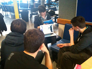
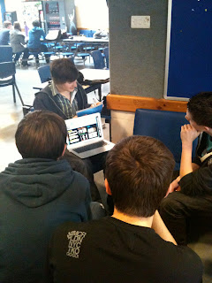
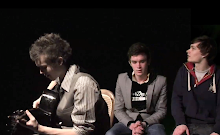
Here are some photos from our focus group. we placed a selection of people to sit down in front of a computer, we then let them see our website and use all its functions, we then asked them to analyse its design, accessibility, layout, colour scheme, and any other variables they wished to comment on. we have taken a photo of one feedback as an example to some of the response that we received.
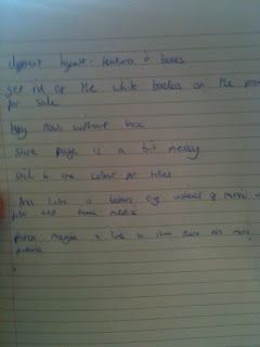
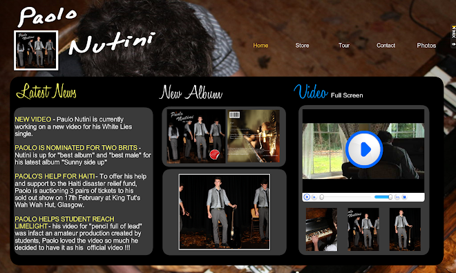
One key item that was highlighted was the fact that the features should be placed in boxes to make a clearer layout,and to separate the information. another key point was to make the boxes transparent, as it was more aesthetically pleasing and made it look less amateur.
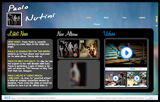
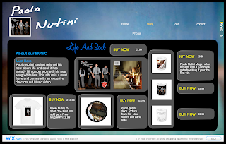
We listened to the feedback and as you can see from the screen shots we have place grey boxes over the different sections of righting and stuck to a tighter colour scheme, only using a few key colours.
Adam


No comments:
Post a Comment