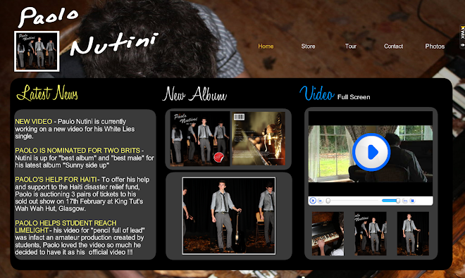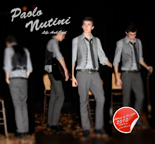
I was looking at Poalo Nutini’s website to see the style he’s trying to create, and to find out the type of people that listen to his music, and see if I can incorporate any ideas from his website into are music video. I found lots of references to his music in the images on the website for example, here is a image from the website
 and the album is called sunny side up. I notice from the layout and colour use that the style that Paolo Nutini is going for is a indie/acoustic feel sort of like Jamie T where he is trying to be one of a kind. His website is very similar to Jason mraz website using similar colour grade to incorporate the indie feel.
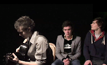
 I also found out that if you become a member you could get exist to his blog for his fans to talk about what they like or dislike like about Paolo Nutini. So I thought this would be a get way to get people that are familiar with his work to see if are ideas are similar, or just think that maybe the shots would work well with the music. Here is the blog I posted on the website to make the fans come onto are blog

Eddie


